
A Tool to Help Women Understand Their Preterm Birth Risk
Using 8.9 million births from CDC data to make risk personal

Using 8.9 million births from CDC data to make risk personal
Preterm birth — delivery before 37 weeks of pregnancy — is the leading cause of death in children under five worldwide and the single largest contributor to infant mortality in the United States. Babies born too early face immediate threats like breathing failure, brain bleeding, and life-threatening infections, and those who survive often carry long-term consequences including cerebral palsy, learning disabilities, and chronic lung disease. In the U.S., roughly 1 in 10 babies is born preterm, a rate that has been rising over the past decade despite advances in prenatal care. The costs are staggering — not just the estimated $25 billion in annual healthcare spending, but the immeasurable toll on families who spend weeks or months in neonatal intensive care units not knowing if their baby will come home healthy.
When a pregnant woman asks, “What are my chances of delivering early?” most doctors give a vague answer. Something like “About 10% of babies are born preterm.” That number is true on average.
But averages hide enormous differences. A 25-year-old privately insured Asian woman with a normal BMI has a very different risk than a 35-year-old Black woman on Medicaid with obesity. Both deserve to know their number, not the national average. That is what ethics and informed consent are all about.
What Should You Do With These Data?
These data are not meant to frighten women — they are meant to inform them. When a first-time mother sits across from her doctor and asks about her chances of delivering early, she deserves a specific answer rooted in millions of real births, not a vague reassurance or a national average that may not reflect her reality.
This calculator gives clinicians a tool to make that conversation concrete and honest. For women with elevated BMI, for example, the data offer something rare in medicine: a modifiable risk factor with a clear, measurable impact that can motivate preconception weight optimization before it is too late to matter.
For Black women, the data make visible what the medical system has long failed to address — that their preterm risk remains two to three times higher than White women even after accounting for age, insurance, and weight, pointing to structural forces that no individual lifestyle change can fix.
For hospitals and policymakers, these numbers should drive resource allocation: targeted preterm prevention programs, equity-focused prenatal care models, and honest conversations about why, in the richest country in the world, the zip code and skin color a woman is born with still predict whether her baby will be born too soon.
The goal is simple — take 8.9 million birth records that have been sitting in a federal database and put them where they belong: in the hands of the women and clinicians who need them most.
ObGyn Intelligence and ObMD.com built a free, open-access calculator that does exactly this. It uses 8.9 million birth records from the CDC Natality database (2016–2024) to show the absolute risk of delivering before 32 weeks and before 37 weeks.
The user selects four variables — race/ethnicity, maternal age, insurance type, and pre-pregnancy BMI — and gets a personalized risk with a 95% confidence range.
Every result also shows side-by-side comparisons across all racial/ethnic groups and all BMI categories, so disparities are immediately visible.
Try the calculator: HERE
Why These Four Variables?
We chose race/ethnicity, maternal age, insurance, and BMI because they are the strongest population-level predictors of preterm birth available in birth certificate data. Each one tells part of the story.
Race and Ethnicity
Racial disparities in preterm birth are among the most persistent inequities in American medicine. In our data, Non-Hispanic Black women have a very preterm rate (<32 weeks) of 1.77% — compared to 0.74% for Non-Hispanic White women. That is a 2.4-fold difference.
This gap does not disappear when you control for BMI, age, or insurance. It persists across every stratum. This tells us something important: the disparity is not simply explained by obesity or poverty.
It reflects the cumulative impact of structural racism, chronic stress, environmental exposures, and unequal access to care. Women deserve to know this, and clinicians need to see it in the numbers.
Maternal Age
Age affects preterm risk at both extremes. Adolescent mothers face elevated risks due to biological immaturity and social factors. Women over 40 face higher rates driven by increased medical complications, higher rates of assisted reproduction, and age-related vascular changes. Age is not modifiable, but it is essential context. A 42-year-old needs different counseling than a 28-year-old, even if everything else is equal.
Insurance Type
Insurance is the best available proxy for socioeconomic status in birth certificate data. Medicaid patients consistently show higher preterm rates than privately insured women across all racial/ethnic groups. This reflects not just income, but access to early prenatal care, nutrition, stable housing, and workplace protections. Including insurance allows the calculator to capture a dimension of social risk that BMI and age alone cannot.
Pre-Pregnancy BMI
BMI is the only modifiable risk factor among our four variables — and the data show a striking dose-response relationship. Among Non-Hispanic White women aged 25–29 with private insurance, the preterm rate rises steadily from 5.2% at Normal BMI to 10.4% at Obesity III (BMI >39.9). That is a doubling of risk. The same gradient appears across every racial group. This makes pre-pregnancy weight optimization one of the few evidence-based interventions a woman can act on before conception. BMI belongs in this tool because it is actionable.
What Does the 95% Range Mean?
Every risk number in the calculator comes with a range in parentheses — for example, 1.77% (1.74%–1.79%). This is the 95% confidence interval. Here is what it means in plain language:
We are calculating a rate from a very large but still finite number of births. The true risk for women exactly like this is almost certainly somewhere within this range. A narrow range (like 1.74%–1.79%) means we have a lot of data and the estimate is very precise. A wide range means fewer births fell into that specific combination and the estimate is less certain.
We used the Wilson score method rather than the simpler standard formula. The Wilson method works better when the percentage is very small (like <1%) or when sample sizes are modest. It avoids the problem of confidence intervals that dip below zero, which makes no sense for a birth rate.
For clinical counseling, the confidence interval is important. If two groups have overlapping ranges, the difference between them may not be meaningful. If the ranges do not overlap — as is the case for Black vs. White preterm rates at virtually every combination — the disparity is real, not a statistical accident.
What the Data Show
Among 8,871,460 singleton, vertex, first-birth deliveries captured in the CDC Natality database from 2016 to 2024:
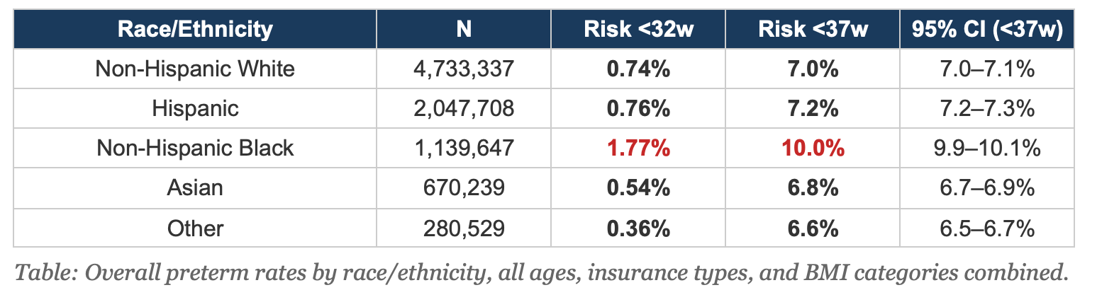
The racial disparity is the headline finding. Non-Hispanic Black women have a preterm rate that is 43% higher than the overall population and nearly 2.4 times the Non-Hispanic White rate. The confidence intervals do not overlap. This is not noise. And it persists after stratifying by age, insurance, and BMI — meaning it cannot be explained away by differences in these measured risk factors.
How to Use This in Practice
This tool is designed for prenatal counseling. When a first-time mother asks about her risk of preterm birth, pull up the calculator, enter her demographics, and show her the result. The comparison tables allow a natural conversation about how race, BMI, and social factors affect risk.
For a 30-year-old Non-Hispanic Black woman with Obesity II on Medicaid, the preterm rate is 13.0%. For a Non-Hispanic White woman with the same age, BMI, and insurance, it is 9.6%. Showing both numbers side by side opens the door to an honest conversation about health equity — one grounded in data, not assumptions.
The BMI comparison is particularly useful for preconception counseling. Showing a woman that her risk drops meaningfully if she enters pregnancy at a lower BMI gives her concrete, personalized motivation — not a lecture.
Limitations
This calculator shows population-level risk, not individual prediction.
It does not account for prior obstetric history (because these are first births), cervical length, progesterone use, smoking, substance use, or other individual clinical factors.
The data include only gestational ages 24–41 weeks and only Medicaid and private insurance (not self-pay or other). Birth certificate data have known limitations in BMI accuracy. The tool is a starting point for conversation, not a substitute for individualized clinical assessment.
The Bottom Line:
Women deserve specific answers, not averages.
We built this calculator because 8.9 million birth records should not sit in a government database when they could sit in a counseling conversation. The data are free.
The disparities are real. And the only modifiable risk factor on this list — BMI — is the one where honest information might actually change outcomes.
Try the calculator: HERE
Data source: CDC WONDER Natality Database, 2016–2024 Expanded. First births, singleton, vertex presentation. Gestational age 24–41 weeks. Medicaid and private insurance.